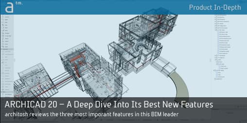
GRAPHISOFT introduced version 20—the latest version of its industry-leading BIM application—back in 2016 and we wrote about it in a major feature here. However, in this review type feature we take a ‘deep dive’ into the three top focus areas in version 20: (1) the new user interface, (2) graphic overrides, and (3) the “I” in BIM.
The goal of digging deeper should be obvious. We discover, for example, the edge of functionality with the new graphic overrides technology, but the BIM pioneer—always thinking ahead—provided the not-so-obvious answer to addressing ways to get beyond this edge.
It is safe to say that the link between graphic overrides and the effort to put the “I” in BIM runs deep in this release. But it is just as safe to say that this technology is foundational to progress that will be made in years to come. With that point in mind, the new UI update is appropriately timed.
User Interface Changes—Small Things That Are Big
The user interface update in version 20 is one of the biggest new changes. At first, it may seem just cosmetic because overall the UI design is essentially the same. I recall an interview discussion with Viktor Varkonyi, CEO of GRAPHISOFT, about why he said you can’t just radically change a user-interface in a program like a BIM tool. It boils down to not disorienting your existing user base.
So what are the new UI changes about if things are essentially the same and not disorienting to existing users?
Visual Design
The answer falls into two logical buckets. The first is visual design. A new “flat” look permeates the new version, a look that reflects modern or current UI design preferences, embodied both out on the web, in mobile apps, and—principally for the Hungarian software company—in Apple’s iOS and macOS operating systems. It is an obvious nod to younger generations coming up in the industry who are more mobile device centric technology users than the Boomer generation or even Gen-X architects in the industry.
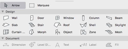
01 – The toolbar icons embody the essence of the new “flat look” in ARCHICAD 20’s new UI.
There are a few more things that should be said about this new flatness look. Things are substantially cleaned up and although the icons and graphics behind the UI are now based on scalable vector graphics (.svg), a perhaps “heavier” file format, the stripped back look speaks to a truth that every CAD/BIM vendor should be extolling—your users demand speed, so keep things light weight. (image 01)
Some graphic highlights worth mentioning about the new UI include the user of Helvetica Neue and San Fransico fonts for macOS users) and for all users more space between items in palettes, larger icons, and some use of all bold lettering in panel titles.
Functions
The new user-interface carries substantial functional user-interaction (UX) changes, though admittedly most of this operates at a subtle but powerful level. Take for example the ability to transfer view settings from one tab to another tab through the new Inject View Settings command. (see image 02)
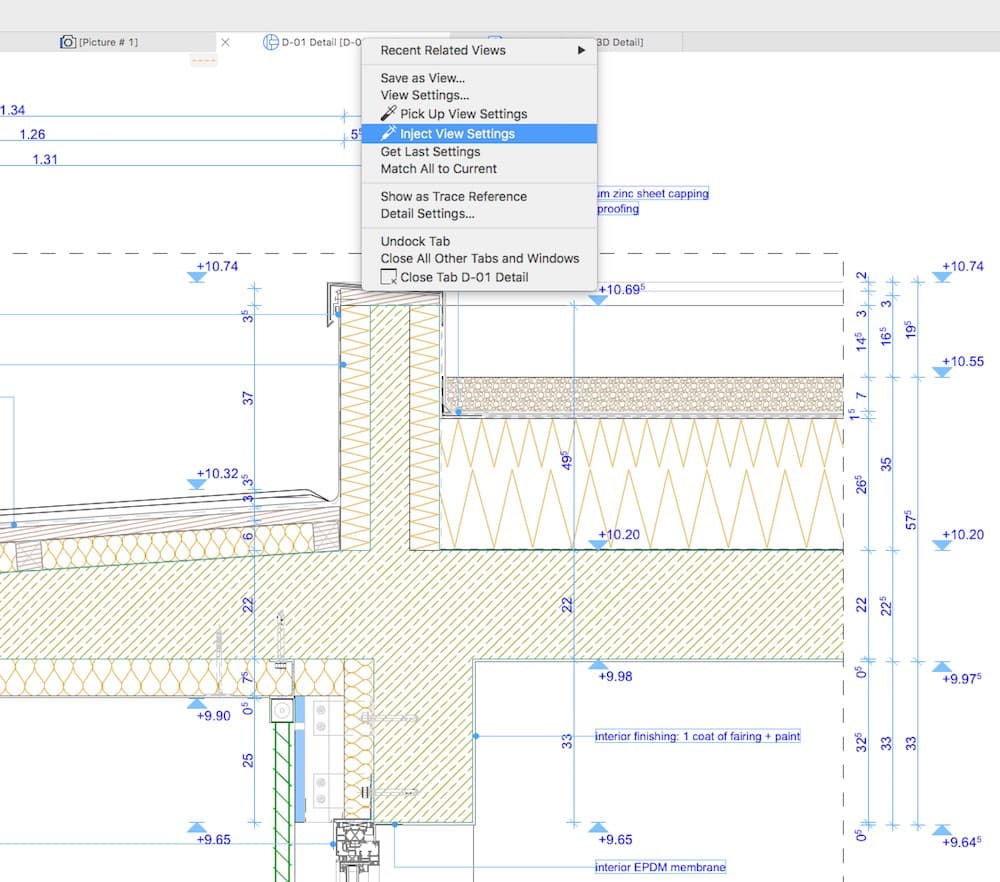
02 – View properties are now transferred from tab to tab through new menu options via right-clicking on tabs themselves.
Another powerful, subtle change is the dynamic nature of UI panels. When you widen the main viewport window, the left-sided Toolbar dynamically reconfigures between icon only mode and icon with text mode views. The Info Box above, also cleaned up, intelligently eliminates items like the scroll bar first, then the panel headers but with the scrollbars back, then the scroll bars and panel headers.
The new Quick Options Bar at the bottom is a big change as well—with a streamlined set of options. Notable improvements include the way functions like zoom and orbit buttons appear and change based on the nature of what type of view is active, in a particular tab. In 2D only views, you get Previous Zoom, Next Zoom, and Increase Zoom tools and Fit to Window—and just these. In 3D views you gain Orbit and 3D Explore. (see image 03)

03 – Intelligent UI palettes automatically reconfigure, and new expandable options enable ultra-wide working conditions in the main viewport window. You can see the new Quick Options Bar by clicking on the image above and viewing the items at the bottom.
The new Graphics Overrides features are accessible in a popup on the new Quick Options Bar. This means no matter what view you are on, you can turn a graphic override on and make it active for that view. (More on Graphic Overrides in a moment).
The tabs features are also improved. Firstly, moving from tab to tab no longer transfers the view settings from the first active tab to the next tab automatically. Each view maintains its view setting properties. You can now “pick up” a particular tab’s view settings by right-clicking PickUp View Settings and then use the new Inject View Settings feature on another tab.
These are just some of the new functional improvements related to the new UI. But before we leave this topic one more is really worth mentioning. Many of the palettes now have automatic vertical height adjustment. For example, the Navigator palette expands and contracts vertically based on items under each category. But an extra cool new feature is how under Settings dialogs panel titles collapse and expand automatically in order to make panel contents visible somewhere in the middle of the dialog itself. So there is never any need for a vertical scrollbar for a dialog.
next page: New Graphic Overrides—Visualizing Building Data Differently

Reader Comments
Comments for this story are closed