We last reviewed version 1 of BeLight Software’s Live Interior 3D back in 2007. Today at version 2.1.1, Live Interior 3D Pro has evolved into a mature product, comes in two veresions (Standard and Pro), and includes several new features we’d particularly like to focus on. Firstly, Live Interiors 3D Pro is now capable of supporting multi-storey interiors. So we’ll take a look at that. Additionally, our Pro and Standard version of Live Interior supports the creation of camera paths for shooting QuickTime videos of your interior designs….and, it can also produce panoramic QuickTimeVR movies. So we’ll look at both of those as well as a few other major new features such as further Google SketchUp integration, custom light source editing in furniture objects and more.
To get a fundamental understanding of the overall program we suggest that you read our first review (from version 1). In this review, we will focus on the new features and the overall quality of this software. BeLight Software itself has a nice array of high quality videos demonstrating the many features and capabilities of Live Interiors 3D version 2 on its own site, which we highly recommend you check out.
Some Basics First – Floor Plans
Live Interior 3D allows you to start your project using some template floor plan arrangements (click on the link to see image) or types but you don’t have to. Although the templates come in a lot of common arrangements if you don’t see anything close to the configuration of your apartment or house you can start from scratch.
Drawing walls in Live Interior 3D is very easy. There are several really nice touches in this program. For instance when you click the wall tool the Inspector palette provides you the ability to set up profiles for crown and base mouldings, making these apart of the wall assembly rather than separate elements added to the rooms later. This saves time. A series of master walls gives the user the key walls they will need for exterior walls, including various thicknesses used in common construction.
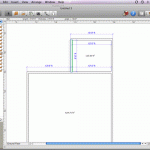
Walls snap together very well in this program; however the real beauty comes when you decide to move walls or move a single wall. To do this you simply select the wall with the selection arrow tool, the wall will highlight green and there will be green diamonds at the ends of that wall plus a double-arrow icon over the center of the wall–implying slide me in either direction. That is exactly what you do to adjust the location of the wall. The beauty comes next when dimensions of the wall–and other key walls touching the wall you are moving–appear automatically and adjust dynamically as you slide the wall around. Once you reposition the wall those dynamically driven dimensions disappear. (see images 01 – 02) We find this feature much easier and more powerful than many of the highend CAD software programs we review that cost hundreds more. The appearance of the dynamic but temporary dimensions is really an outstanding feature.
Of course in Live Interior 3D Standard and Pro you can always add permanent dimensions and annotations (notes) to your drawing to produce the common types of blue-print or construction drawings you seek.
Multi-Storey Design
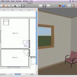
Now in Live Interior 3D (Standard and Pro) you have the ability to add a storey below or above the current storey you are working on. You can add not just one but several stories (Pro), creating multi-story apartments or homes. And with the stair tool you can link these stories together. (see image 03)
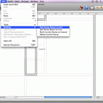
To create a storey below or above you current storey you do so by selecting menu Edit > Building > Add Storey Above Current command. (see image 03) In doing this the storey below you will appear in gray. The Project Tree will than display a series of boundary walls that align with the boundary walls of the storey below or above your current storey. If you choose to delete your new storey you do this from the same menu. You can also create storeys, edit their default heights and other storey related functions by using the “Building Properties” tab on the Inspector palette.
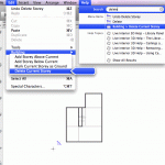
04 – Live Interior 3D has excellent help system. Here it helps us find the command for deleting a storey.
In testing this we also got our hands wet with Live Interior 3D’s Help system; this taps some of the Mac’s underlying technologies, we believe, for sophisticated guidance systems that not only allows you to learn about the particular features in Live Interior 3D but also show you the menu commands that pertain to this feature. (see image 04)
Next page: Google SketchUp and 3D Warehouse integration.



Reader Comments
More informative site….and more information here,…That is exactly what you do to adjust the location of the wall. The beauty comes next when dimensions of the wall–and other key walls touching the wall you are moving–appear automatically and adjust dynamically as you slide the wall around.
Force Factor
Comments are closed.