NATURALLY, MOST DESIGN STUDENTS are aware of scholarship competitions. Vectorworks is interested in seeing young designers succeed and any undergraduate or graduate students can enter the Vectorworks Design Scholarship. In this feature, we profiled three of its recent winners.
Design Excellence over Technology
The Vectorworks Design Scholarship evaluates candidates’ work across a balanced judging rubric, looking at aspects of design quality, concept, originality, presentation, and—of course—effective use of digital technologies.
Competing for prizes and cash worth $10,000 USD, this international design scholarship draws entrants from around the globe, with particularly strong submissions from Europe and the United States. Students typically enter a myriad of projects, including thesis, capstone, or group projects. It’s also strongly encouraged to enter multiple projects to increase your chances of winning the desirable prize money and exposure.
Open Pocket
Ningxin Cheng and Kalen McNamara were in different years in their architecture degrees at Rice University, in the United States, when they submitted their group project titled Open Pocket. It is the most recently awarded Richard Diehl Award winner—the top international prize worth $7,000 USD to be applied to future educational endeavors. This was in addition to the $3,000 USD they both won from the US award.
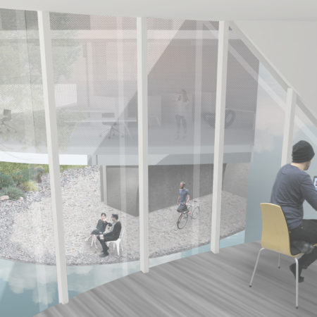
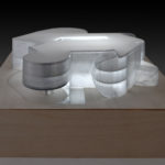
Open Pocket. An image of a research area that is called an open pocket in the parlance of the design thinking of this award-winning student project. (image: Ningxin Cheng & Kalen McNamara / Architosh. All rights reserved.)
Cheng and McNamara designed Open Pocket as part of a Totalization studio at Rice, an advanced studio track that emphasizes the nature of the architect as the vital orchestrator at the center of diverse teams. Designing a three-story, multi-use building on Johnson Space Center campus, the students benefitted from having NASA as a conceptual client and visiting NASA teams. That interaction was pivotal.
“Space flight is a pretty incredible human activity,” says Kalen McNamara, “but its also an amazing endeavor that has a poetic quality.” The duo wanted their project to reflect the fact that JSC doesn’t just generate inventions but also pursues discovery. This seems reflected on multiple levels in their design, a building that houses public amenity spaces on the first floor like a cafe and gallery, while serving NASA researchers and visiting scientists with workspaces and guest accommodations on the second and third floor, respectively. The project name comes from the notion of a terminal space that is any space that is separated from the main open plan. “There is a difference in what we call a pocket from a conventional terminal room,” says Ningxin Cheng, “because a conventional terminal room is typically off a corridor, and you enter from there; we are trying to get the sense of a terminal room but have them feel very connected to the main public space.”
There is a difference in what we call a pocket from a conventional terminal room, because a conventional terminal room is typically off a corridor, and you enter from there; we are trying to get the sense of a terminal room but have them feel very connected to the main public space.
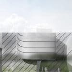
Formally, Open Pocket presents itself to the observer as a series of curved and flat, metal-clad surfaces, some suspended over the ground, with variable visible permeability. The essence of the floor plan is indeterminate from viewing the structure from the outside, generating intrigue about its inner workings. Its facade material further reflects this, a mixture of composite materials consisting of semi-translucent, perforated, and reflective plastic panels with fritted and non-fritted glass. Speaking about the variable visual penetrability, Cheng says, “we are using a double facade, and the optical effect of that double facade is useful. So when you are on the ground floor, the upper level, which houses residential uses, is less visible because of the way the two systems overlap.”
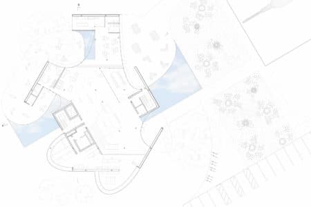
The floor plan of Open Pocket offers both open and semi-private areas for building users and visitors alike. (image: Ningxin Cheng & Kalen McNamara / Architosh. All rights reserved.)
Other aspects are driving at the building’s overall form, including the overall JSC campus site and navigation through that campus. “We see that different user groups have different access points. And that means that they have different starting points and different sequences for experiencing the building, and that means the overall form of the building is decided upon based on these differences between different groups.”
Cheng and McNamara primarily developed their project in Rhino, developing a complete 3D model but not a BIM model. “We actually did not use Vectorworks on this project,” says McNamara. “It would have been really useful if we had it, especially because of its BIM capabilities, because we had to develop our project to a higher level of technical detail as required of the Totalization studio. But we entered this competition and won, and now future students at Rice will have this tool.”
All winners of the Vectorworks Design Scholarship gain both cash awards for future studies, academic travel, or other educational purposes that they desire. In addition, their colleges get free Vectorworks software for their labs and free training.
The Other Place
Alexander Drachenberg submitted his final year project and won the Architecture scholarship prize in 2017. He finished his degree in architecture from Bergische Universität Wuppertal, in Germany. His project was a compelling urban intervention operating at multiple levels as both city infrastructure for crossing a large canal as well as a multi-use large building structure for public and private functions.
The Other Place is primarily a museum project that spans a canal in Hamburg, Germany, in an old industrialized zone the city wishes to revitalize over time. Clad in metal panels and offering the observer a futuristic and sleek city landmark, The Other Place building is essentially four to five floors that operate as bands that twist inside the structure itself. “Most of the time the structure is four to five floors,” says Alex, who notes that as you move across areas of the building, you rise up or down twice. “So if we start at zero, at 90 degrees you are up 10 meters, at 180 degrees you are up 20 meters,” he adds. “And then you go up and down again” on the final 180 degrees. “So you are always experiencing the interior and exterior from different levels as you walk through the loop.”
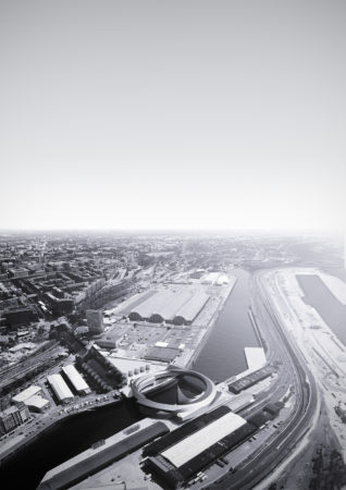
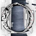
The Other Place. A very compelling image of the winning museum project as it spans a canal. (image: Alexander Drachenberg / Architosh. All rights reserved).
This new museum in Hamburg project includes public amenity uses like cafes and restaurants that, like the public loop that takes city occupants from one side of the canal to the other, operate entirely independently from the museum itself. Alex says these types of uses are critical to activating the area, which is approximately equal on both sides of the canal. “The main problem right now is the area is split by the canal in the middle,” adds Alex. “It is nearly two equal parts on east and west, and that is why the museum in the middle can function as circulation but also at the same time as a place where people want to spend time.”
…you can do a lot of stuff like that directly in Vectorworks, which is much different than other programs. It combines a lot of tools in one.
Much like Open Pocket, the museum building’s plan is curvilinear in nature; it also offers a dynamic tension between its curved inner walls, slow lifting or falling floors, and disappearance and reappearance of the key reference point—the canal. Alex explains that the structure is designed a lot like a concrete bridge, with its structural box below and concrete deck above. This time that deck is not entirely flat, and its structural box is a void filled with program elements. In this case, primarily, it is a museum with inner spaces that reflect different genres of museum architecture. This was purposeful, aimed at eliminating the standard, white cube-like museum exhibition space. “If you went back 100 years ago, museums were designed internally for the artifact,” he says. “that has been lost in today’s museum design that is designed for flexibility.” By combining older schema for museum designs, and various ones, his new museum can house artifacts that are more suited for particular spaces.

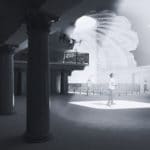
The Other Place. The museum building is essentially a bridge structure and spans nearly 100m over the canal. (image: Alexander Drachenberg / Architosh. All rights reserved)
Visualizing this museum is not easy, especially internally. Alex developed the intricate 3D model for this project using Rhino and Grasshopper. He then took model views and placed them in Vectorworks. “Detail drawings and sections coming from the 3D model were pretty rough,” adds Alex, “so at times I just drew the rest in Vectorworks because it was easier than modeling everything.” Today’s architecture students are often highly facile from moving from program to program. “Vectorworks is pretty popular in Germany, especially in University,” says Alex. “I learned about it from a friend who was using it at work. It has this huge library, and you don’t always have to move from Vectorworks to Photoshop; actually, you can do a lot of stuff like that directly in Vectorworks, which is much different than other programs. It combines a lot of tools in one.”
Alex graduated a few years ago after winning this award and soon went to work at UNStudio in Amsterdam. “I was really interested in parametricism, which is why I went to UNStudio,” he says. Now at SOM in Chicago, he is working on large projects where he has direct access to innovative engineering in MEP and structures directly within the same practice. “I am super happy at SOM; we have engineers, mechanical people, structural people and they are sitting right next to each other, in one space, and you learn a lot from them.”
Dormouse — Staying in the Old Barn
Sophia Rodermund’s winning project in the Interior Design category begins with highly emotive watercolor paintings setting and capturing the mood and experience of summertime camp experiences for children. An interior architecture graduate from Hochschule Ostwestfalen-Lippe, University of Applied Sciences, in Germany, Sophia’s artistic approach to her project set her work apart from other entrants. The process of storytelling begins before the first drawings are seen.

Sophia did a storyboard of watercolor paintings to develop the narrative qualities of her award-winning project. (image: Sophia Rodermund / Architosh. All rights reserved.)
“I am really interested in painting, that is kind of my hobby,” says Sophia. “The watercolors are of the children; the pictures were actually what I showed at the beginning, so when I started my presentation at the university, I started by showing a little picture book. To start the story of the project, I wanted to start with a very adventurous atmosphere.”
This approach for narrative and atmosphere envelopes Sophia’s entire design entry and is reflected in her richly layered and emotive drawings and renderings.
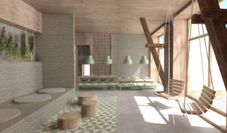
A rendering of the project was implemented fully in Vectorworks with post-production Adobe Photoshop. (image: Sophia Rodermund / Architosh. All rights reserved.)
Set in a pastoral setting, Dormouse — Staying in an Old Barn is a project for children. An old barn is the site location for an interior architecture renovation. Given the option for her master’s thesis of having her professor choose a site or finding a real project site herself, Sophia selected an old semi-abandoned old barn 20 minutes away from where she lives. “I knew this barn from when I was a child,” she added. “It is totally empty; they don’t really use it. I thought it would be a great idea to use it and renovate. And because it is nearby, I could also do measurements of the buildings and draw the floor plans.” The barn is set in a setting with house and attachments and was built in 1913. It was used for storing hay.
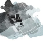
The site plan for the renovated barn project consists of a set of buildings in the German countryside.
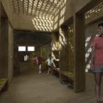
Another rendering of the renovated barn project that houses a day or overnight camp for children 8-14.
Conceived as a summer camp for children ages 8-14, the project consists of three renovated barn levels that include places for activities, improv theater, classes, sleeping, dining, and guests and bathrooms. “This is like a summer camp space for kids,” adds Sophia. “Children can go there to spend the day at the farm, but I wanted them to have the opportunity to stay longer, like a weekend so that they can sleep in this ‘hay hotel,’ and they can eat there and enjoy life in the countryside,” she says.
This is like a summer camp space for kids. Children can go there to spend the day at the farm, but I wanted them to have the opportunity to stay longer, like a weekend so that they can sleep in this ‘hay hotel,’ and they can eat there and enjoy life in the countryside.
The importance of materials for the renovation was vital. The barn was built mostly out of sandstone and brick and also pine wood. “I wanted to stay very basic and natural with the materials,” says Sophia. New materials match up with existing pine wood and the use of clay as well. The “hay hotel” is on the top level, the hayloft level, and consists of open areas that are organized around the structural cadence of the barn structure. The children can stack the hay bales to create large or intimate play spaces.
Sophia’s sectional views and renderings communicate the use of the space and its evocative atmosphere quite well. Streams of light pour through openings and boards in and around the structure. Asked how she produced her winning entry, she said, “first I did a 3D model of the whole building, and for the sections, I used the ‘Section Tool’ in Vectorworks and did a normal section, so you have a line drawing of the building. And everything you see with the colors, textures and those light beams or light rays was done in Photoshop.” For her 3D-rendered views, she used Vectorworks’s built-in rendering engine and did post-processing in Photoshop.
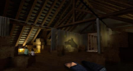
The barn’s third-floor is a “hay hotel” for children who choose overnight camp. (image: Sophia Rodermund / Architosh. All rights reserved.)
“We start in our first or second semester learning Vectorworks,” she noted. “We then learn other programs like Cinema 4D, Rhino, and SketchUp.” “I like that you can do 2D sketches very easily, but I like that you have the opportunity to generate 3D sketches in it as well, and you can switch between the 2D and 3D whenever you want.”
Already experienced in interior architecture from a smaller firm near her university, Sophia is now moving to a larger practice in Dusseldorf. “It’s a big architecture firm, a little less interior design and more architecture for me, but I am very excited. They have a lot of exciting projects,” she says. Asked what she learned from her award-winning thesis project, she adds, “I recognized from my thesis that I am really into existing buildings that have a history and can be adapted,” she says. “I also enjoy working with natural materials. Especially in Germany,” she continues, “we have a lot of existing buildings in smaller towns that are totally empty and not used. I think that is a good opportunity for interior architects to reuse them.”
Lessons — From Scholarship to Practice
The Vectorworks Design Scholarship winners above have all produced fantastic noteworthy work and demonstrated excellent capabilities in both design, design-thinking, and socially locating their skills to the benefit of society. From understanding how to best reflect NASA’s broader mission and importance through architectural expression and plan configuration, to solving complex urban regeneration through innovative cross-use structures, to establishing an awareness of old buildings and their potential revitalization and emotive uses for society. All three winners (four when we count individuals) have demonstrated excellence in design well deserving of further accolades and public recognition.
Allow the Vectorworks Design Scholarship past winners to inspire you to enter your project. The current scholarship concludes later this summer with all submissions due by August 29, 2019. Winners will gain substantial cash to use however they wish, along with free Vectorworks software and training for their college or university.
Hurry and enter here today and before the August 29 deadline!



Reader Comments
[…] in the year, Architosh published a feature on the student work of Vectorworks Design Scholarship winners. Several of them, particularly in […]
Comments are closed.