Continued from page 1
The Winning Characteristics of Inspiration
Obviously an inspiration to survive the BIM process cannot be weak or arbitrary. It has to have characteristics which give it this power. In the workshops we have developed through our work with the AIA we have determined that some of the most critical characteristics of “inspired design” are these:
- Based in the ‘cultural context’ of the client or user base
- Represents in a poetic–not literal–sense an essential value of the culture
- Engenders a positive emotional response from a specific constituency
- Must not try to depict too many messages
- Sufficiently sophisticated to appeal to intellect
- Must appear deliberate not arbitrary
The winning characteristics listed above are listed in the order of importance. We want to briefly discuss each of these. It is not necessary that an inspired design project have all of these characteristics. However, the more of these characteristics they have the better. We will not be discussing the process of using inspiration in this article. It is sufficient to say for the moment that inspiration is a learned skill that might be considered an advanced form of analysis and synthesis and not merely the whim of the singularly creative. Creativity helps but that too — to a certain extent — can be learned.
[For more information on those topics check back here in a few months or check out our website www.eloquentideas.com.]
The Importance of Culture
Distinguish here between ethnic decoration and the culture of an individual, family, neighborhood, town, state, country or global region. The definition of culture for a project will vary with the definition of the scale of the impact of the project. Projects on a regional or global scale, and even at some town and neighborhood levels, must address multiple ethnicities in their definition of culture. Simply incorporating decorative elements will not be enough. Culture must address the values the group lives by and what is important. The larger the region being addressed the more necessary it will be to fall back on elements of culture that reflect the human experience and mythical imagery rather than specific technologies or historical events.
Poetic Sense
Poetry elicits imagery by focusing on critical if small elements of a given experience. In the same way a building which is trying to tell a story cannot affordably try to depict every aspect of the story. This is where the artist/architect must establish what single aspect best represents the frame of mind the story entails and focuses the experience of the building or depicting or refuting that mental framework. Build poetry.
Support a Constituency
Someone has to want to fight for this project. By its very definition the project you are designing is not normal. It will not meet the expectations of everyone as most will expect something “normal” to result. Therefore, if you are addressing a specific culture then do so in a way that energizes a specific constituency to fight for the project. That constituency may include your consulting professionals, the client, as well as local community members and users.

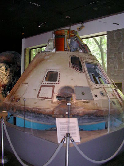
01 – The Fernbank Science Center features an Apollo Six Command Space capsule. Architect, Lisa Stacholy AIA LEED AP. See project details below.
Engage all of these parties in the creation process and they will be more likely to come with you on the arduous journey. Manage them as part of the design process. Give them information on where things stand, what they look like and why. When you fall just short of grand vision, as you inevitably will, let them be as disappointed as you are. They will then also be supportive of your having come so close.
Simple Messages
The more complicated the story the harder it is to tell. It is not that you can not elaborate on the story line. It is that the storyline must remain clear. Romeo and Juliet is still “Boy Meets Girl.” Cultural messages need this same simplicity. The Sydney Opera House imagines sails but not so specifically that it appears to be a recreation of a particular ship though that was possible. Rather it refers to thousands of water based cultures where sails of one shape or another are familiar. This commonality of experience is what gives it its global drawing power.
Sophistication for the People
H.L. Mencken said “Nobody ever went broke underestimating the intelligence of the American public.” Yet in the case of challenging or “inspired design” this becomes a very real possibility. If the meaning is simple without an emotional connection or if it is simply not enough of a story to excite the imagination, then the other elements of support needed will not materialize. Imagine that the Denver airport was based on a mole hill and not the Rocky Mountain Range. Surely it would not be a grand enough vision to cause the changes it has. The inspired concept must be told in a way that creates value for the constituency. It can neither look down upon them nor stand too far above them. Rather, it should lift them — or allow them to lift themselves — higher.
A Deliberate Quality
An inspired concept may not be presented as accidental. This is not to say that there may not have been an element of synchronicity to its creation or that some serendipity affected how the concept was recognized. The important part is that the concept is chosen and presented as a deliberate statement. Some of Frank Gehry’s twisted metal buildings, like the Disney Hall in Los Angeles, are criticized in large part for looking like they were modeled by crumpling up a piece of stiff paper and throwing it on a table. Gehry himself has joked of this. An examination of the actual structure though shows that a significant amount of thought and effort went into the creation of the project. That realization in the experience of the built project is what has earned him accolades. Still, he walks closer to the line between arbitrary and forced than any other practitioner we can think of. Perhaps, the late Bruce Goff’s organic architecture approaches it.
The Real World Has Budgets
At our workshops many people have complained that, “That this kind of talk is fine if you have millions to spend on really small projects or nearly unlimited budgets on large ones. But in the real world we have budgets and we can’t afford to do this!” We are delighted to report that this is about thinking and that budget does not enter into it directly. One can express things in paint and not gold leaf. Budget affects how you express the idea not how much the idea is worth. Sometimes though, if you have really inspired, the client or other constituent groups will create more resources because they see a vision that is worth the effort. This is not unlike the resolution of the energy code issues of the Denver Airport. If there is something worth while at stake the effort will be made. Daniel Burnham may have said, make “no little plans…,” but we are going to show you briefly two small projects where the inclusion of these ideas made the projects far better than they would otherwise be.
FernBank Science Center
Lisa won a commission to design a support classroom for the FernBank Science Center in Atlanta Georgia. The Center had taken possession of the Apollo Six Command Capsule used by NASA, the last unmanned mission. (see image 04 above) The classroom was to be used expressly for youth to study specific ranges of aeronautical space science. The budget was only $200,000 complete. There were limitations on interrupting museum use. The new work had to include workstations for small groups of students to study different aspects of space science and include a central printer location for their use. As well as incorporating the interactive nature of the different work stations (i.e. GPS field work and GPS real-time data). The project also was tasked with increasing the students to what the Fernbank Science has to offer young minds beyond only classroom work as attendance of the science center had fallen over the past decade.
Lisa took as her inspiration how kids of this age look at space science. They don’t think of cramped capsules used in the Apollo program. They think of the spacious and curved bridge of the Starship Enterprise in its various versions. They think of Star Wars and the curves and environments on ships and planets depicted there. In short, her inspiration was popular culture. “Star Trek Space Simulation School” might be how we define it now. (see images 05 – 06 above) The result, as can be seen in the image, is a round classroom on multiple levels that mimics the general configuration of the bridge of the Enterprise. The captain’s chair is actually the printer station. Small MR-16 track lights were used against a black plenum to give an effect of stars in space. Sliding doors were created with an actuator pump that got cut from the project budget. The curved laminated walls were made offsite and erected in portions overnight. The result was so successful that reservations for use of the classroom quickly soared to more than 18 months.
Synergy Salon
Louis was commissioned to complete a tenant uplift for a hair salon in a town just east of Charlotte, North Carolina. The owner, a longtime area resident, is a Vietnamese woman and very aware of the strength of the local vietnamese community as well as its cultural differences from mainstream Charlottean residents. Many of her client base were expected to be immigrants to Charlotte from northern states. She requested a low budget project as her resources were limited. While the space being leased was previously leased as a salon she wanted increased privacy and extensive retail display without looking like a drug store. She wanted to acknowledge her Asian culture without doing so in a way that would make the bulk of her clients uncomfortable. The theme was “Southeast Asia with Charlotte Comfort.” The theme was intended to be somewhat spare without a lot of frills or ornament. The color scheme was to be warm tones that were comforting and with a homelike feel. (see image 07 below) A retail wall was created to separate clients receiving services from the direct view of those entering. The color of the retail was was selected to reinforce the Asian influence. Red, in most Asian cultures, is thought to be a sign of good luck. A bright but sophisticated shade of red was selected for the retail wall. The owner understood that the color signifies death to Koreans and this would discourage that population from entering. While she has not otherwise discouraged Koreans from coming, despite a large Korean community in Charlotte, six years later few of her clients have been Koreans.
The eventual cost of the project, excluding salon furnishings and equipment, was $26/ SF. The price was kept down by the owner agreeing to use some in place equipment and negotiating aggressively with the millwork. The color of the wall was determined and while there were many materials that could have been used, including ceramic tile, marble, treated aluminum and opaque (back-painted) glass, the decision was made to use paint for cost effectiveness. Using it did not affect the meaning or value of the wall or the project.
Principles of the Use of Inspiration
There are more things that we have learned about inspiration than we can list here. There are however several rules worth mentioning. First is that the same inspiration can generate many different conceptual frameworks. Second is that a conceptual framework can have many different expressions. Simple shifts in the context which might range from the local weather to local political environments can result in wildly different projects. The last of these realizations is that Inspiration generates the message not the medium. A change in the medium will also result in a singular project. If the message was “There is a crack in every defense,” then expressing it in glass and steel will result in a different project than expressing it in technical fabric and concrete or wood and translucent plastic. Therefore, inspirations are reusable, and non-exclusive. The expression of an inspiration always falls at it’s core to a singular individual no matter how much others may add to the embellishment and expression of that idea.
Back to BIM
The BIM process as we have shown is not driven by ideology but by technology. Ideology is lost unless it is explicitly inserted into the process. Inspiration does not require the project or the budget to be large. It does require that the artist/architect to select an inspiration and message upfront and to use that as a decision making tool as the design process progresses to keep the inspiration and its story visible in the final built result. The most important part of the BIM/IPD process may well be the few minutes when the architect sketches out a first take of what might express the concept he has thought of and hands that to the lead Revit operator instead of saying “put it in a box.”
Future Opportunities
Architects who embrace this methodology may create an additional billable service by creating a process where, after the function program has been determined, a workshop or meeting — even a series of them — is held to determine the cultural inspiration for the project and begin to work out what that entails. Eventually, those architects who find production and manipulation of building technologies is more their forte than the ideation process, will hire those who specialize in ideation to help them learn to develop those skills. Or they may choose to hire ideation specialists to carry out that part of the design for them. It is clear though that BIM presses architectural firms to produce faster, more and more will turn to boxes leaving the market for more creative firms wide open.
About the Authors
Louis Smith, Jr., AIA, NOMA bases his practice in North Carolina, but also is completing projects in Washington State, and Michigan. With experience in community development, commercial and residential buildings he maintains an active small practice. He writes as well as designs and now offers ideation Services through his firm. Contact him through his website that focuses on ideation and inspiration. www.eloquentideas.com
Lisa Stacholy, AIA, LEED bases her practice in Dunwoody Georgia, just north of Atlanta, She focuses on retail and light commercial renovation and new construction, the scientific and laboratory market, animal care facilities and the occasional residence. She can be often found playing with exotic Bengal cat’s that she raises. She can be reached through her website. www.lksarchitectsinc.com


Reader Comments
Jeffrey, great reply! I agree in particular that T-squares and trace are equally capable of contributing to bad design. I don’t think the authors would disagree with that either. 🙂
Jeffrey, great reply! I agree in particular that T-squares and trace are equally capable of contributing to bad design. I don’t think the authors would disagree with that either. 🙂
Roberta Peterson Rifkind liked this on Facebook.
Amada Baez liked this on Facebook.
Eman Suleiman liked this on Facebook.
June-Hao Hou liked this on Facebook.
Greg Conyngham liked this on Facebook.
Roberta Peterson Rifkind liked this on Facebook.
Amada Baez liked this on Facebook.
Eman Suleiman liked this on Facebook.
June-Hao Hou liked this on Facebook.
Greg Conyngham liked this on Facebook.
Comments are closed.